
(Credit: Matchstic.com)
Public notice signs aren’t typically award-winning examples of sharp design, or titans of type. But a new partnership between Atlanta’s planning department and branding firm Matchstic aims to change that, with a rebrand emphasizing bright colors, simplicity and clarity.
“In Atlanta, the Department of Planning isn’t exactly known for being customer-oriented,” Blake Howard of Matchstic recently told Fast Company. “It’s like the equivalent of the DMV at times. We wanted to make it customer-focused and intuitive, and overhaul the visual branding to re-assert the department’s priorities.”
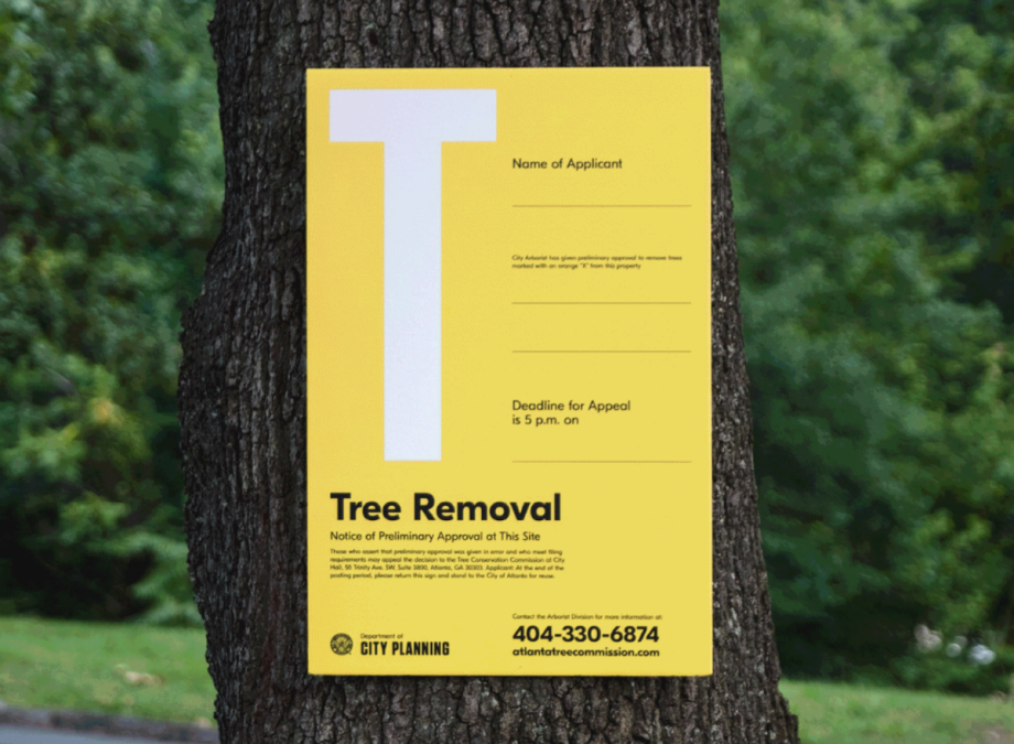
The city department’s new signs adhere to a consistent visual hierarchy, with bright colors and single letters given to each kind of public notice (“T” for tree removal, “B” for bike-share). Notices are often written in legalese, and many of those jargon-filled, technical phrases can’t be changed. But Matchstic designers decided to break up the text, place the most important phrases front and center, and cluster legal details off to the side, much like footnotes.
“It’s an exceedingly simple approach, but a brilliant example of how design can cut through bureaucratic systems to convey information clearly to the public,” according to Fast Company.
City halls from New York to St. Paul have been getting more creative with connecting art and artists to everyday municipal governing, especially when it comes to efforts around community-engaged design.
Designers have been tapped to visualize historic flood patterns. They’ve also given their energy to projects important to public agencies even if they’re not working directly with them, such as the mapping of the cost of mass incarceration. Mary Miss, the first artist-in-residence for New York City’s Department of Design and Construction has been working on a framework for what designers and artists can accomplish within city agencies.